

Large public sector digital redesigns fail in familiar ways.
Not because teams don’t care.
Not because they didn’t do research.
Not even because they lack skills or experience.
They fail because, at critical moments, judgement is not asserted.
This post reflects on the Bureau of Meteorology website redesign, launched publicly in 2025 and widely criticised for degraded usability. I see this not as a cautionary tale about a single organisation, but as a lens on a pattern I’ve seen many times across large-scale programmes, in government and beyond.
The lesson is not ‘do more research’. It is to use research to clarify what matters and demonstrate improvement. But also to design governance that meaningfully protects user experience the same way it protects security, budget and delivery milestones.
Scope and evidence
This analysis is based on design, research, and usability documentation released under Freedom of Information in January 2026, including behavioural archetypes, information architecture reports, usability testing summaries, and the ROBUST Program Closure Report.
The BoM has advised that these materials represent only a subset of documents produced during the seven-year ROBUST program. Over the last two months I have been requesting additional usability reports and DSS assessments; as of publication, these have not yet been made available.
Where I have drawn conclusions here, they are based not on speculation about what may have occurred, but on what is visible in the documented evaluation and governance approach.
If additional material comes to light that materially changes this analysis, I will update this post accordingly.
What the redesign set out to do and why that made sense
At a strategic level, the apparent goals of the website redesign component of the ROBUST program appear to have been entirely reasonable:
modernise a complex, legacy-heavy site
improve accessibility and consistency
support a wide range of audiences and use cases
establish a scalable information architecture
future-proof the design
These goals are inferred from the program context and the kinds of work evidenced in the released artefacts, as well as the broader ROBUST framing around resilient public services.
The documentation reflects serious effort:
behavioural archetypes
journey maps
decision-making models
analytics-informed IA
search research
multiple rounds of usability testing
This was not superficial work. It was structured, methodical and well-resourced.
What the public experienced instead
Post-launch public feedback was consistent:
radar information harder to interpret
observations more difficult to find
wind detail less visible
familiar workflows disrupted
expert users slowed down
This wasn’t a catastrophic failure, but it was additional friction and a degradation in service that shows up as lost time, eroded trust and workarounds.
During cyclone preparation, a community member posted a side-by-side comparison of the old and new radar views, describing the new interface as “imprecise”. In the comments, people shared links to the legacy site (reg.bom.gov.au), encouraged each other to bookmark it, or switch to recommended and preferred third-party tools.
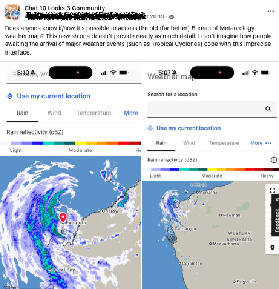

That behaviour is important.
When users don’t like change, they complain.
When tools stop supporting critical tasks, they route around them.
Is this just resistance to change?
This is a reasonable question and a common explanation when the public reception to a redesign is poor.
Redesigns are disruptive. Experts are often the most vocal critics. But there is a difference between “I preferred the old version” and “I can’t find what I need anymore.”
Much of the public feedback fell squarely in the second category.
But to really know for sure, we need an impartial measure of usability.
This is where usability benchmarking is crucial when undertaking a redesign project.
If the redesign demonstrably improved task completion rates, speed, or accuracy compared to the previous site, then early dissatisfaction could reasonably be attributed to familiarity effects.
No such benchmark comparison is visible or referenced in the artefacts made available.
How extensive research can lead to weak outcomes
The issue wasn’t absence of research. There was apparently lots of research and even more data. The problem was the absence of deliberate prioritisation of tasks and expert judgement about what should have been non-negotiable.
Not all requirements need to be discovered through research. Some are self-evident.
Logistical and ethical issues make conducting research during a weather emergency challenging. But, for a national weather service, rapid and comprehensible access to warnings, radar and forecasts during severe conditions is not an emergent insight. It is part of the service’s remit.
Research can tell you how people behave under normal conditions. Judgement determines how examples like emergency conditions must be positioned in the hierarchy of prioritised tasks the design must support.
Good research practice doesn’t stop at interviews and data. It includes working closely with subject matter experts inside the BoM to identify tasks that are known to be critical, even if they don’t surface in discovery interviews or high-volume analytics.
The BoM employs meteorologists, scientists and operational staff with deep domain expertise. That expertise almost certainly includes a good understanding of what information and which tasks are critical for users during severe weather.
This expert understanding doesn’t compete with user research, it enriches it and helps inform our judgement.
If the highest priority tasks, informed by research, data and expert judgement, had been explicitly defined, they would likely have shaped both the design and the evaluative research in ways that better protected the quality of the user experience.
Instead, the documentation suggests a different emphasis.
1. Coverage was prioritised over criticality
The usability testing approach emphasised coverage:
coverage of behavioural archetypes
coverage of website structure (the system)
coverage of stakeholder interest
What’s not visible is a set of prioritised, non-negotiable tasks. The user experiences that absolutely must not regress.
Criticality could be identified through a combination of:
risk (what happens if this fails?)
frequency (how often is this done?)
urgency (how time-pressured is it?)
trust (does failure undermine confidence?)
All projects inevitably involve trade-offs. In research, one key trade-off is the decision of which set of questions to seek to answer, or the usability tasks to test.
In the absence of a list of critical tasks, it seems that the tasks used to evaluate the usability of the design became more representative of the internal system of the BoM, rather than the users.
On the BETA1 usability testing report supplied by the BoM, the following tasks were included:
You’re researching for a high school project, and you are interested in finding information about tropical cyclones - how would you find this information?
Now you have located the content, you want to find the definition of tropical cyclone, where would you go to find that?
It seems unlikely that a large audience would realistically have navigated the BoM website to find this kind of information. Nor would finding it be time-critical, or carry substantial risk if the task failed.
Including these kinds of tests in critical usability testing studies is difficult to justify as high-priority usability testing in a national weather service context.
The closest thing to an seeking weather information in a storm or other weather related crisis identified in the supplied documentation was this one:
You are an events planner, and you want to find out if there are any current warnings and alerts for <state> to understand if your event can go ahead tonight. How would you find this information?
It is plausible that there were rounds of usability testing undertaken on identified critical tasks, emergency context tasks, high frequency tasks, or more complex expert stakeholder tasks, but nothing in the documentation made available by the BoM thus far makes any reference to this.
2. Task design for convenience, not consequence
The usability tasks written for the BETA1 usability study also reveal two common research craft anti-patterns.
First, participants were asked to role-play user types they were not. In addition to pretending to be an event planner in the previous task, participants were also asked to imagine:
You are a site foreman, and you want to know if tomorrow is a good day to lay concrete in Sydney. Where would you go to find weather information for tomorrow?
You are a farmer and want to know what the temp and rainfall for 6pm yesterday in Mittagong was. How would you find yesterday’s rainfall?
It is reasonable to ask someone about checking weather before travel. It is less defensible to use proxy participants for domain-specific users whose expertise shapes how they interpret data. I can’t help but wonder if the BoM did a round or two of usability testing with farmers in regional Australia focussed entirely on checking that the website met their needs and was usable in their contexts, what else they may have discovered?
Second, tasks were sometimes framed around site features rather than underlying goals. For example:
You have saved some locations as favourites and want to access them now. How would you do that?
Feature-led tasks reduce friction in testing and make it harder to detect whether the design meaningfully supports the task. Neither of these choices are outrageous. Both are common.
But both bias results toward reassurance rather than discovery.
3. Success was defined without a baseline
Task 2.1a: You are planning to visit Sydney on the weekend. You want to check the forecast. What is tonight’s overnight low and will it rain at 10pm?
The documentation reports that the above task scored a 74% success rate in usability testing. This means that 1 in 4 people failed to complete this task.
The accompanying commentary reads, ‘The success rate for this task was high with 23 out of 31 participants easily finding both data sets’.
Is a 74% user success rate high for this task? I’m not sure I would be celebrating that 26% of users failed to achieve what would arguably be one of the more frequent and simple tasks to do on the BoM website.
What about this one?
Task 4: You are a site foreman, and you want to know if tomorrow is a good day to lay concrete in Sydney. Where would you go to find weather information for tomorrow?
What’s an acceptable success rate for this one? Again, it feels like something that everyone should be able to do without too much trouble on the website, right?
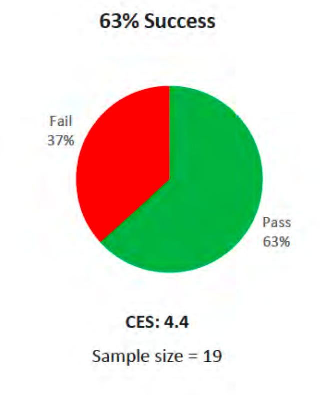
Usability testing showed that 63% were successful with this task. The commentary in the report reads:
‘The success rate for this task was good with 19 out of 30 participants finding the 7 days forecast with ease.
But, here is the reality - without benchmarking against the legacy site, these figures are uninterpretable.
If the old site achieved 95% success, that’s regression.
If it achieved 50% , that’s an improvement.
The point isn’t that 74% or 63% is inherently good or bad. It’s that without a baseline, we don’t know if we’re getting better or actually going backwards in the quality of the experience design.
And when improvement is the stated goal of a redesign, not measuring against what came before is a significant omission.
4. Research activity was not visibly anchored to governance gates
In the FOI documentation supplied, there was no evidence of any connection between user experience outcomes and stage gate progression in the ROBUST program.
I sought confirmation of whether the redesign had undergone formal Digital Service Standard assessment. The Digital Transformation Agency (DTA) advised me that no assessment reports were available. Also that the assessment model itself has since been discontinued as it was considered ‘too cumbersome’.
That context matters. Policy only shapes outcomes when it is enforced. When experience quality is not formally gated, it competes with other delivery pressures and delivery usually wins.
Criteria 2 of the Digital Service Standard emphasises user research and iteration, but it does not explicitly require benchmarking against the existing service or any other method to demonstrate measurable improvement or preservation of critical task performance.
The ROBUST Program Closure Report however is detailed and thorough, documenting governance, tranches, advisory groups, risk, operating model uplift and benefits realisation.
What it does not contain is any meaningful mention of user experience, let alone a consolidated evaluation of whether the redesigned website measurably improved usability of critical tasks.
In large programmes, what is codified as a gate becomes a constraint. What isn’t, doesn’t.
Security was codified.
Governance was codified.
Benefits realisation frameworks were codified.
Usability performance does not appear to have been codified in the same way.
That doesn’t mean no one cared about it. It means it was not structurally positioned as non-negotiable. It was not subject to scrutiny and quality control in the same way other aspects of the program likely were.
And that is reflected in the feedback from the public to the redesigned service.
A systemic pattern
I’ve seen this before, up close.
In large public programmes, senior leadership is generalist by design. Meetings centre on delivery, risk, budget, governance, and assurance.
UX becomes a workstream. An object to be delivered on time and on budget. But not something that is easily scrutinised for quality, because generally there is no framework in place for that to occur.
Governance prioritises what it can formalise.
When trade-offs arise, the things that are formally gated win.
The things that aren’t, don’t.
Where accountability lies
Large transformation programs are rarely delivered by a single actor. Government agencies set direction and governance. Expensive consultancies often provide capability, capacity and advice. Delivery teams do their best to mediate between the two.
But the government controls the rules of the system.
Government decides:
what must be demonstrated before progression,
what constitutes success,
what risks are unacceptable,
and what evidence is required to justify change.
Consultancies optimise within the incentives and constraints provided to them.
This is particularly acute when it comes to user experience. Unlike security or financial governance, where government has established frameworks and can draw on deep internal expertise to set and assess standards, UX quality requires craft knowledge that generalist leadership rarely holds. In practice this means the commissioning agency often relies on the consultancy to define what good looks like, and to assess whether it has been achieved. The consultancy is, in effect, marking its own work. Not necessarily out of bad faith, but because the governance architecture leaves no one else equipped to do it.
If measurable improvement in critical user tasks is not a mandated condition of progression, it becomes a negotiable quality rather than a non-negotiable requirement. But if the government agency is not meaningfully involved in the selection of the prioritised user tasks, the consultancy can do all the right things and still fail to protect the user experience.
Accountability, then, is not primarily about whether a consultancy designed the right navigation pattern. It is about whether the commissioning agency supplied the right expertise and judgement to prioritise tasks, and then required evidence that the redesign demonstrably improved or at least preserved the usability of those critical tasks.
Governance shapes behaviour. And governance is ultimately a government responsibility.
We expect better outcomes
This wasn’t a trivial undertaking. It was part of a major, multi-year programme involving significant public expenditure and major consulting partners.
It is reasonable to expect that when we modernise a public-facing service relied upon by millions of Australians, improvement is demonstrated, not assumed.
Measurable, defendable improvement in the tasks that matter most.
The public doesn’t read closure reports. They rely on the service delivered.
And if a redesign feels slower, harder, or less clear in critical moments, that perception becomes reality, regardless of how many artefacts sit behind it.
How we do better
Not more research. Better judgement of the research for decision making and evidence of improvement.
And user experience is protected as part of the project governance.
Start with a task inventory, not just archetypes and needs.
Explicitly identify priority tasks that must not regress.
Benchmark against the existing experience.
Tie usability performance to milestone progression.
Test with real domain users where expertise matters.
Make prioritisation rationale for tasks visible and contestable.
Include the requirement that critical tasks are identified and do not regress as part of the project governance and risk management.
None of this is radical. But it requires judgement and the willingness to make difficult trade-offs.
Even good research does not absolve us of the need to choose, to prioritise, to use our expert judgement and the judgement of subject matter experts to guarantee the bases are covered.
When we don’t explicitly articulate that user experience matters and then structurally defend it, the system decides for us.
And although the infrastructure work may have been the larger technical achievement in the ROBUST program, once again, it is the user experience that got the headlines.
Note:
Since the initial launch in October 2025 the BoM has done and continues to ship changes to the website in response to user feedback.